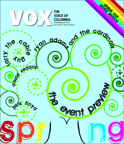
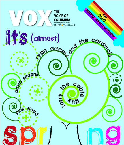
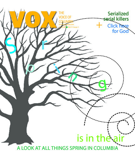
This week at Vox I was re-designing my spring cover from the weekend, which was:
I think I came a long way and am actually really proud of my new covers. One of my biggest critiques was that the original looked fallish. I think I definitely made the new covers springy. The editor also wanted some of the sell lines incorporated into our designs which I also did and liked the way it turned out. It came a long way with only a weekend to design.
I do think the covers are maybe a little too busy. I could play with color more perhaps, of instead of using swirls for the tree use fully colored in circles to make it more concrete. A small note is I need to change the color of the apostrophe in the second cover, its still black--Oh, the difference of detail.
I made all of the covers in Illustrator which is becoming a favorite of mine--except I don't know how to do as much as I would like to know. But, every design I do in Illustrator I learn a teeny bit more.
FUTURE PLANS:
This week is my "Inside Columbia" (the local city magazine) week. I handle the fashion department and so I've been running around town coming up with ideas for the shopping page and look of the month. The shopping page shoot is tomorrow (which I get to "direct") and then I will photoshop the images and design the page. For look of the month I find a model and an outfit and help direct that too and that will be Friday--but I'm awaiting spring shipments at the boutiques.
I will also be working on my redesign of my Faces of the Economy feature over the weekend and just redesigned the music cover. Here it is:
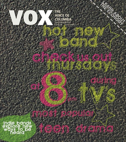
My idea was from this photo I took during the photo journal:
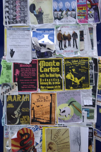
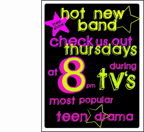
So originally I had more of a flyer looking design but couldn't figure out how to place it on the cover page. So then I decided to have it look like they wrote it on the pavement in chalk..a lot of small bands do that in Columbia around campus. I know I need to find a new font to love (I used that one in both the spring cover and this cover). I also want to find a pavement that is just concrete instead of the rocky texture of my current one. However, I like the overall concept. I'm having a little bit of a creative draught, so If you have any tips I'd appreciate it. Here is a look at the flyer like image I created:

Jena,
ReplyDeleteI think your redesign of the cover is definitely a step in the right direction. However, I don't immediately get the fact that you are trying to use tree imagery in your most recent design. The colors are much improved though.
I disagree, I love the fact that the tree imagery is so subtle and that the spirals play a dual role. I also love the chalkboard blockletter typeface you used! Although the colors feel a little too neon for "spring" (to me, at least).
ReplyDeleteI agree with Aimee. I think the new tree design is much improved in legibility and style, but the color scheme screams rainbow bright. And your redesign of your assignment one cover is fun, too. It's a unique concept with great typography (like Aimee said). Great job this week!
ReplyDeleteI think the redesign of the cover was a great improvement. It definitely speaks more about spring! Also, the type on your first cover redesign is great.
ReplyDelete