Wednesday, March 18, 2009

Response>>The Industry

Over the last few weeks in editing we had some guest speakers come in to 1) help us learn how to get in the industry and 2) other publications to think about working for. To address the second point first, I had never really thought about alternative weekly's. Even though thats what Vox is for the most part, I didn't really realize I suppose that other cities had those. I was excited to hear about the editorial flexibility they have and therefore hopefully, art flexibility. I've also decided after some thought that working at a smaller more flexible publication will be more for me. The thought of sitting behind a computer and being constrained to a template every week would drive me crazy. I also know that designers have to pay their dues but at a smaller publication the chance of moving up faster is certainly more likely.

To address the other point, a J-school professor at MU, Amanda Hinnant, spoke to us about her experiences at Glamour and Real Simple. Her tips were helpful as far as what is expected when we enter the professional working world. I think we are often quite catered to as far as--well I was sick so I didn't come to class--or I was so stressed I didn't do my best on the project--and her lecture helped me to realize those days are over. I also learned that while our portfolio's are REALLY important, networking is the most important and getting yourself noticed. I think for me that will be the hardest as I tend to be a bit shy around strangers. Time to man up! (That's sexist, I know-sorry!, but I can't think of any other way to put it!)

You Can't Miss>Logo Pond

I thought this would be helpful this week since we are all redesigning our logos this week. It's full of awesome logos for companies of all kinds. It is also a chance to get your work out there. You can pay a fee to submit logo designs, but there are also awards for the logos that win. Below is a logo that one last year. The logo is for Fido Computers.


There are two different sites...the main site is.. and the awards are featured on

Hope this helps!

CRITIQUE>WEEK 8

CRITIQUE:

This past week I designed another spread for the art department of Vox. It's not being published until 3/26, so I'll put it up after that. The story was about album cover art. I had a little fun with the placement of the album art, and if I could go back I probably would have wanted to have a say in what album art was chosen just because it was a chance for the art department to shine and not just have an everyday photograph.

Last week I also spent time designing a cover for a photo story about women in traditionally men's work roles. The cover won't be running because the photo story is no longer taking place but I had fun with this cover so I will still post them! The Kick Ass Women one is my favorite with the muddy boot and the typeface. I think it's strong and would work well as a cover. The other one is more typical and if I revise it I may not use the "lipstick" typeface.


WHAT'S NEXT:

This week I'm revising 3 logos. Everyone liked the black and white one that looks like a maze, which was also my favorite. I'm going to play with making the lines smaller and choosing a better typeface. There were a few ties between others that were well liked, so I haven't made a decision about the other's to revise. I will be posting the revisions soon.

I am also working on a new cover taking the place of the cover that was scratched last week. It is about a play called The Verge which is about what women want. The cover is supposed to be a photo cover but we are allowed to stray from that.

I finally, over spring break, will be working on my own fashion spread from the photo shoot for Inside Columbia, putting together slideshows and department pages for the Country Home project and hopefully getting a big handle on my own website.

Wednesday, March 11, 2009

Response>>MAP

I attended the MAP session by Photo Editor of 417 magazine, Edward Biamonte. I have a love for photography and often see myself going down that path one day. So, attending his session was helpful and it also helped me get a feel for the magazine (a place I may apply). He talked alot about the work that goes into great photos and how important it is to know the technical aspects of photography. I took a photojournalism class last year and learned a lot of the technical aspects but I am a little rusty. I also know absolutely nothing about lighting but I do plan to take a class someday. His lecture made me want to get out there and take more photos so if any fellow photo enthusiasts ever want to get together to shoot let me know. It's fun and motivating to look at a professionals photos and think (I could do that!...with a LOT of practice, of course), but still it seems a reachable go which makes you want to get out there and do it.

I also learned how important photo selection is for a magazine--it truly gives the magazine its style and edge. I'm going to use that knowledge when working on countryhome.com & when putting together my "mock" feature spread from the spring fashion shoot.

Here are some of edward's photographs. His website is...www.edwardbiamonte.com.. check it out!


You Can't Miss>>Killed Ideas

There is a new blog I learned about from the blog I follow designerswhoblog.com. It's being headed by Steve Hall of AdRants. He is looking to have a blog with all of those great ideas that have been axed. I think it's a great tool for us to look for inspiration. We also can submit our axed ideas! It is also a MAJOR encouragement to keep that stuff that maybe isn't quite there yet in some type of binder to go back to. A great idea is a great idea, even if it doesn't work in a certain situation. It seemed with the logo assignment there was a lot of negativity (myself included), so keep your chin up designers, as they would say in grade school, there are no bad ideas! (Even though there are, haha, but, you get what I'm saying!) There is an application on the site. There is a focus on the site more so for advertising ideas..but it's also worth a shot. The deadline is March 31st at midnight & submissions can all be made online. The website is killedieas.com

Week 7

This past week I didn't do much for Vox. I worked on some logo designs and finally have the results of my Inside Columbia spring fashion shoot.

CRITIQUE:

My logos..well, they are okay. I tend to wait til the last minute to design. It's when I produce the best work, usually. But, if I'm not feeling creative but I have to pump something out it can get difficult. I like to use words to brainstorm and often look at google images, too. But if my creative juices aren't flowing and I find images I like, its hard to move past those images and further them as my own. So, I struggle with that and look forward to redesigning your favorites!


I also finally got the proofs from the spring fashion shoot for IC. A quick reminder that I didn't do this design or pick the photos. I styled this shoot--i.e. pick out the outfits. I LOVE how it turned out.. it's my most sophisticated fashion spread yet. The geometric look is my favorite and I think it offers alot of choices for our readers. I think it also gives some encouragement to try a look that's not necessarily "you," our model, Brynn, felt that way with the country look. I also was given all of the photos from the shoot and will be photo editing and creating my own spread for my portfolio--it will be up soon (i hope)!


I haven't brainstormed about what I will do with the design..but, we will see.

WHAT'S NEXT:

I just got through working on the Vox 4/2 cover about women. I will be posting those next week so stay tuned. I will also be working on my art department design this week that is about famous album cover art. I am trying to think of a creative way to show the amazing covers. I will also be working alot with flash this week/end to put together slideshows for our project with countryhome.com. I will also be trying to work on some redesigns and my own website. Oh, to sleep.

Monday, March 2, 2009

Week Six

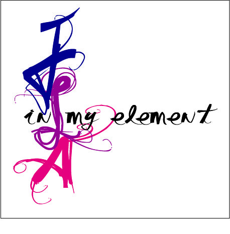
The weeks are seriously flying by....I'm starting to become a nostalgic senior who doesn't want this to race by as fast as I originally thought...

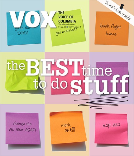
CRITIQUE: This week at Vox I finished up my cover for the March 5th issue called "The Best Time to Do Stuff." I really like how it turned out. It's an improvement from my original idea, much more sophisticated and polished looking.  The biggest thing I learned from working on this cover is what a team effort it becomes in the production stage. I initially designed it but then the Creative Director of Vox (and our TA, Meredith) really helped me out. She also worked closely with Taryn the Art Director of Vox to put on the finishing touches. It was just a reminder for me of how important it is to always have others input in your work because nine times out of ten it seems it will always come out better in the end with a little help from your peers. I will post the final version after Thursday when it is published! Stay tuned. 


With that said, I also just want to say thank you to my colleagues for the portfolio critiques. They were really helpful. I have a better idea of what I need to work on, what I need to add, etc. 

Continuing...

I also worked on my department page at Vox two Sunday's ago which was published in last Thursday's issue.

I like it for the most part, as I mentioned in previous posts I became super frustrated with trying to fit the text as best I could. I really wish the "Altered Realities" photo could have ran bigger, its a great piece of artwork. My next department page is going to be about album cover art. We were asked today at our Vox staff meeting to start going a "step above" in our department pages so I am trying to think of something cool....hmmmmm....

Sorry you aren't seeing an image of my breathtaking department page.... the file size is to big .. hmm..any help from you techies out there?


And finally...

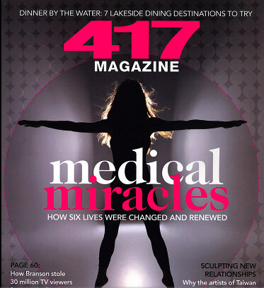
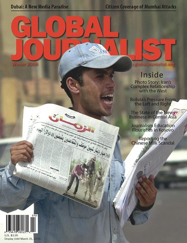
Here is the "most final" Global Journalist cover. It is definitely more typical of their cover look..which is OK. I really looked for a different photo because they ran a cover not too many issues ago with the same man selling a newspaper photo. I also don't think the photo is very eye catching. But, the consensus seemed to be that it was the photo that best represented the story, oh, content driven design. It also gave me some practice in clipping masks. I had to clip the man and place him on top of the original image in order to be able to put him in front of the Global Journalist flag. Overall, I think it is okay. I really wanted to play with the sell lines but then remembered that this publication doesn't get bought on the newsstand, its simply sent out to subscribers/readers all over the world... but, I still think I may encourage them to do something a little more interesting with the headlines in the future because sometimes readers need a little encouragement to tackle an editorially heavy publication and attention grabbing sell lines may just pull them in!


WHAT'S NEXT:

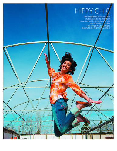
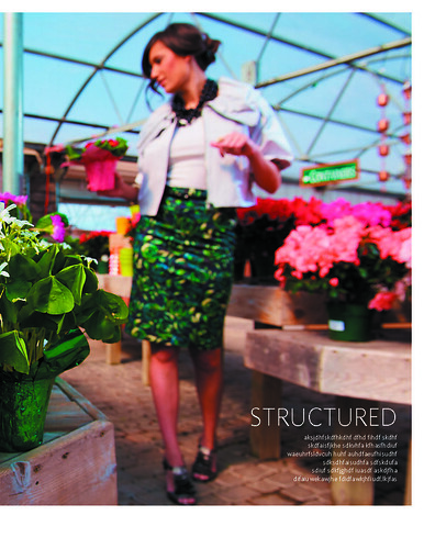
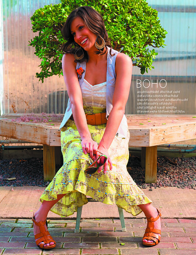
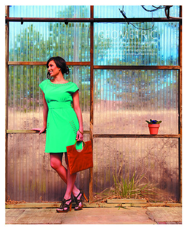
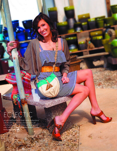
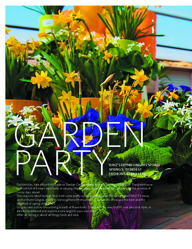
This Wednesday I will be working on a photo shoot for the magazine I intern at, Inside Columbia. It is our spring fashion spread. I am happy with all of the looks I came up with and am excited for the shoot. Although I don't get to design much for the magazine outside of little department pages, I am going to ask for all of the photos from this shoot, choose the photos and create my own spread for my clip book...just to show that I can do it! :)

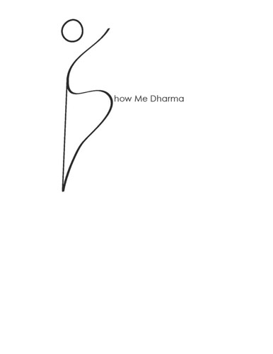
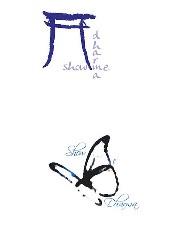
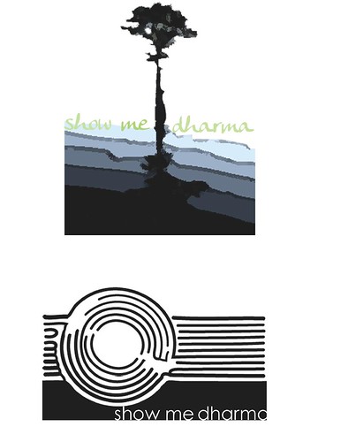
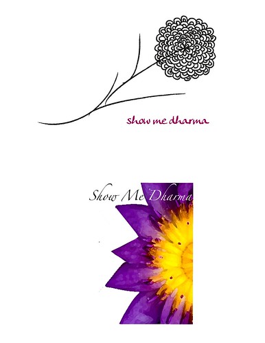
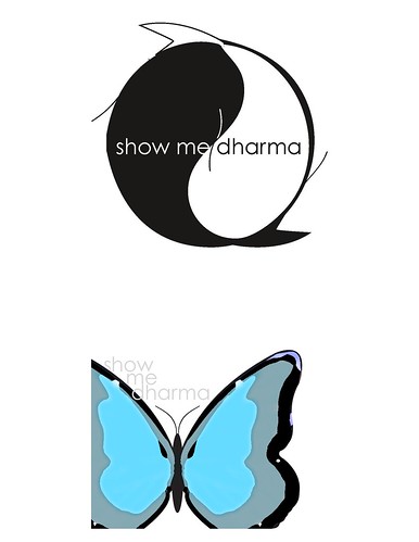
I am also going to try to work on my website this week.. as well as the logos for our 20/10 assignment. 20/10 is an assignment where we come up with 20 logos for a Mizzou wellness programs (our two choices are programs called Eat for Life and Show Me Dharma) and execute 10.. all by next Tuesday to help us learn how to think creatively, quickly.

See you next week!


Response>>True False

Our lovely town of Columbia, Mo. puts on a film festival every year called True False. It's a festival of documentary films, lectures, discussions, parties...the whole nine yards. It's growing in popularity and bringing in some big name films. In my time here at Mizzou I never once attended the festival. It was always one of those things I knew I should do but never got around to it. So, thank you to our professor Jan for requiring us to go. It was worth it.

I saw a film called Burma VJ. It was basically about these undercover video reporters who secretly film the injustices going on in Burma and smuggle the footage to news stations all over the world like the BBC. The film was definitely a reminder of how thankful we should be for the freedom of speech that we have. Even as designers, although we aren't using words we have the power to say so much with a photo or illustration or design--often having more impact than a story or a headline. 

I worked for the magazine Global Journalist last semester which I gave you all a little background info about to accompany the recent design work I did for GJ and their Spring 2009 issue. This film definitely placed a high importance on the publication who seeks to expose the injustices journalists around the world face. I know many of us weren't too excited about designing for the publication because it is more formatted and serious...but the film reminded me of the cause behind Global Journalist and I am definitely a little more grateful for being able to work on such an important publication. It also shows how well rounded we can be in our designing. 

You Can't Miss>>Design Porn

The blog I follow, designers-who-blog.com, basically leads me to all the other great design sites/blogs on the web. The one I looked into this week is definitely a "You Can't Miss," and was voted by Netdiver as one of the best/most influential sites of 2008. 

The blog is called Design Porn, but no worries, there is no porn on this blog! They just use the name and have fun with it as a theme throughout. Under the tag "oral" is cool music videos, under "toys" is product design, under "spanking" is bad design.. haha..i know, it's a blog for a design company called AmoebaCorp out of Toronto. Bottom line is that the site is fun and has some great design stuff. Here's the link: http://www.designporn.ca/

Also, and most importantly, you have the chance to become a contributor on this site which I thought was kind of cool. Take a look at the application, its bazaar...but I think it's important to be aware of the "creative" questions we will face in interviews and on applications as we try to enter the professional creative world. Here's a link to the application:

Here are some photos someone shared on the blog about being GREEN in design...Very cool. 

<
<<>