Our first assignment was to create a cover and feature for Vox magazine, a creative and fun magazine about the lovely town of Columbia, Mo.
My first week at Vox certainly did not go as planned ( as life never does! ) After a last minute trip home to Chicago and a winter storm covering my path back to Columbia, I missed my opportunity to critique my designs for the cover and feature competition. My mind being elsewhere, I also missed my chance to really focus on the assignment and show what I can do. But I will re-do, re-do, re-do! I invite your comments about my designs so I can use them when I continue to tweak and alter these initial designs.
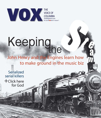
THE COVER:
The cover story was about lesser known, indie bands trying to make it in the big music biz. The current trend to get your music out there is to sell the license to your album or a song for TV and movies. The main source for this story was the band John Henry and the Engine. My favorite paragraph was the last, building some visual imagery for the reader. The paragraph stated:
"If John Henry and the Engine can continue gathering fans with each show, they should be able to keep building momentum. 'What we're doing right now is exciting," [John Henry] Parr says, "We're just trying to keep the steam going.'"
So, perhaps slightly hokey, I wanted to up play the train imagery. A little Thomas the Engine, "I think I can," perhaps.
In hindsight, I would have kept the train image. The old train and black and white color give it a hint of classic-an adjective bands like John Henry and the Engine want to hear. I would have done more with the word "steam," I think I could find a more puffy, soft font. I think I could also make the letters appear as if they are a part of the smoke, instead of sitting on top of it. I also couldn't make a decision about color, a problem I face more often then I'd like. I think a shade of red would have had more punch. I also played with putting the main cover line parallel with the train, the words going from small to big. I think it may have made it less traditional and I will play with it more.
THE FEATURE:
The main story in this issue of Vox was about..dun dun dun..the economy. However, the story, to me wasn't as scary or uninviting as most stories about the economy. It was welcoming and seemed to put the economic situation in perspective. Although our economy is in bad shape, it will keep going, move forward, and grow. With that in mind I wanted my design to create that had the same balance the story did. Wanting to have a little bit of fun, and because our choices of photos were limited, I used photoshop to place their portraits in the dollar bill. At first my feature only used their to "dollar bills" on the spread, but then I decided to make it more subtle and place their "dollar bills," with the other faces of the economy that have become so important. I lowered the opacity of the money image so it could be seen through the word "faces." My idea with that was these men, these "faces," our going to allow us to "see through" the economy. I placed economy on a page almost completely bare and alone to represent the bare state our economy is. The second spread I really struggled with. Portraits or pictures at a desk simply aren't that eye catching so I used the graph line to draw a little attention to the photos of these men. I repeated the graphic on the final page for the sidebar. The graph takes you from the easier terms in the bottom left, to the slightly harder ones in the top right. Overall the design seeks to show the belief of one of the story's subjects, Max Cook, that an economic climb may coincide with more knowledge of the economy.
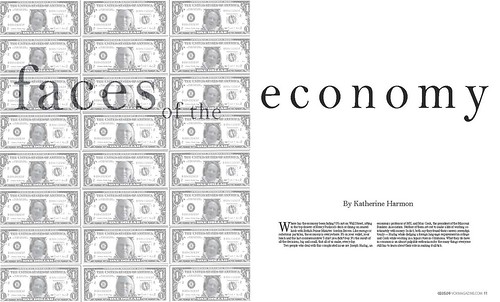

Hindsight for this one is simply that I think I had too many things going on at once. I think faces and the economy should have been centered on the page. Faces could have maybe been slightly larger too. Again, color was a bit of an issue-since the economy isn't flourishing I thought keeping it black, white, and grey would help to illustrate that. In the redesign I may play with shades of green. I also think on the first page of the second spread it is too text heavy. If I ditch the idea of having economy stand alone on the first spread, page 2, I could put more text on the initial spread. Or, I may make my pull quote larger, or perhaps enlarge the photos. I like what I did with the sidebar information, but color may also draw some more attention to it.
(Again, I invite your brutally honest opinions.)
WHAT'S NEXT:
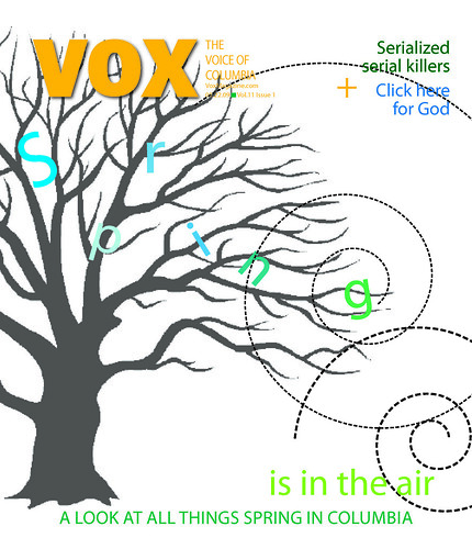
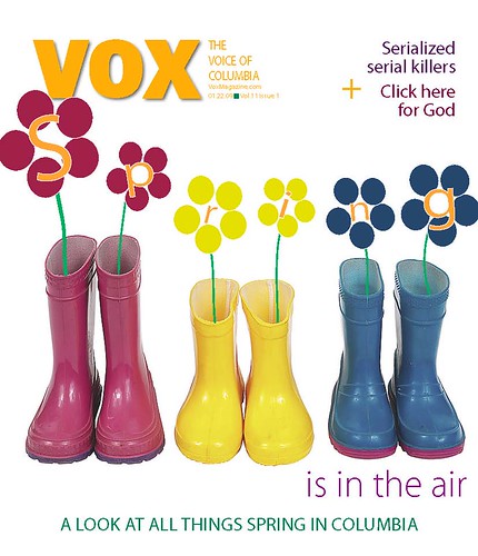
I'm working on the cover for the spring preview. I have two below. I'm leaning towards the tree design. I need to make the words spring pop out more, though, and perhaps lighten or color the dotted wind swirls.
I will also be working on my week long photo journal which I am really excited about, I love photography, and the graffiti assignment.