Monday, March 2, 2009

Week Six

The weeks are seriously flying by....I'm starting to become a nostalgic senior who doesn't want this to race by as fast as I originally thought...

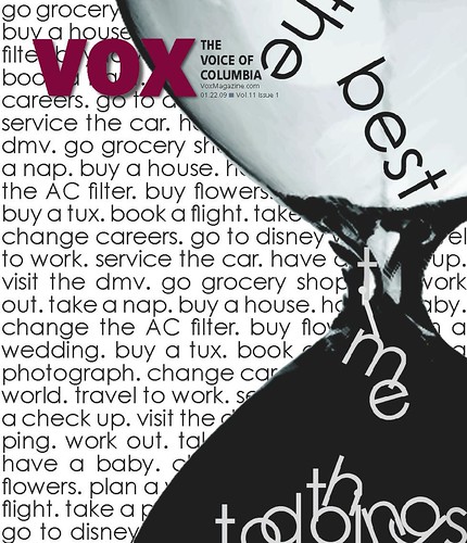
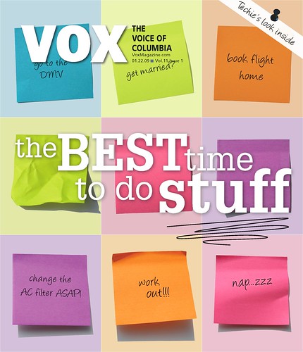
CRITIQUE: This week at Vox I finished up my cover for the March 5th issue called "The Best Time to Do Stuff." I really like how it turned out. It's an improvement from my original idea, much more sophisticated and polished looking.  The biggest thing I learned from working on this cover is what a team effort it becomes in the production stage. I initially designed it but then the Creative Director of Vox (and our TA, Meredith) really helped me out. She also worked closely with Taryn the Art Director of Vox to put on the finishing touches. It was just a reminder for me of how important it is to always have others input in your work because nine times out of ten it seems it will always come out better in the end with a little help from your peers. I will post the final version after Thursday when it is published! Stay tuned. 

With that said, I also just want to say thank you to my colleagues for the portfolio critiques. They were really helpful. I have a better idea of what I need to work on, what I need to add, etc. 

Continuing...

I also worked on my department page at Vox two Sunday's ago which was published in last Thursday's issue.

I like it for the most part, as I mentioned in previous posts I became super frustrated with trying to fit the text as best I could. I really wish the "Altered Realities" photo could have ran bigger, its a great piece of artwork. My next department page is going to be about album cover art. We were asked today at our Vox staff meeting to start going a "step above" in our department pages so I am trying to think of something cool....hmmmmm....

Sorry you aren't seeing an image of my breathtaking department page.... the file size is to big .. hmm..any help from you techies out there?


And finally...

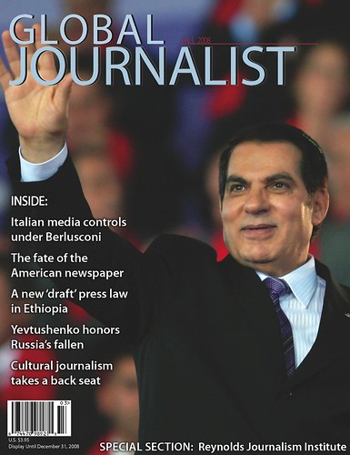
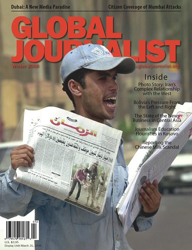
Here is the "most final" Global Journalist cover. It is definitely more typical of their cover look..which is OK. I really looked for a different photo because they ran a cover not too many issues ago with the same man selling a newspaper photo. I also don't think the photo is very eye catching. But, the consensus seemed to be that it was the photo that best represented the story, oh, content driven design. It also gave me some practice in clipping masks. I had to clip the man and place him on top of the original image in order to be able to put him in front of the Global Journalist flag. Overall, I think it is okay. I really wanted to play with the sell lines but then remembered that this publication doesn't get bought on the newsstand, its simply sent out to subscribers/readers all over the world... but, I still think I may encourage them to do something a little more interesting with the headlines in the future because sometimes readers need a little encouragement to tackle an editorially heavy publication and attention grabbing sell lines may just pull them in!

WHAT'S NEXT:

This Wednesday I will be working on a photo shoot for the magazine I intern at, Inside Columbia. It is our spring fashion spread. I am happy with all of the looks I came up with and am excited for the shoot. Although I don't get to design much for the magazine outside of little department pages, I am going to ask for all of the photos from this shoot, choose the photos and create my own spread for my clip book...just to show that I can do it! :)

I am also going to try to work on my website this week.. as well as the logos for our 20/10 assignment. 20/10 is an assignment where we come up with 20 logos for a Mizzou wellness programs (our two choices are programs called Eat for Life and Show Me Dharma) and execute 10.. all by next Tuesday to help us learn how to think creatively, quickly.

See you next week!


Response>>True False

Our lovely town of Columbia, Mo. puts on a film festival every year called True False. It's a festival of documentary films, lectures, discussions, parties...the whole nine yards. It's growing in popularity and bringing in some big name films. In my time here at Mizzou I never once attended the festival. It was always one of those things I knew I should do but never got around to it. So, thank you to our professor Jan for requiring us to go. It was worth it.

I saw a film called Burma VJ. It was basically about these undercover video reporters who secretly film the injustices going on in Burma and smuggle the footage to news stations all over the world like the BBC. The film was definitely a reminder of how thankful we should be for the freedom of speech that we have. Even as designers, although we aren't using words we have the power to say so much with a photo or illustration or design--often having more impact than a story or a headline. 

I worked for the magazine Global Journalist last semester which I gave you all a little background info about to accompany the recent design work I did for GJ and their Spring 2009 issue. This film definitely placed a high importance on the publication who seeks to expose the injustices journalists around the world face. I know many of us weren't too excited about designing for the publication because it is more formatted and serious...but the film reminded me of the cause behind Global Journalist and I am definitely a little more grateful for being able to work on such an important publication. It also shows how well rounded we can be in our designing. 

You Can't Miss>>Design Porn

The blog I follow, designers-who-blog.com, basically leads me to all the other great design sites/blogs on the web. The one I looked into this week is definitely a "You Can't Miss," and was voted by Netdiver as one of the best/most influential sites of 2008. 

The blog is called Design Porn, but no worries, there is no porn on this blog! They just use the name and have fun with it as a theme throughout. Under the tag "oral" is cool music videos, under "toys" is product design, under "spanking" is bad design.. haha..i know, it's a blog for a design company called AmoebaCorp out of Toronto. Bottom line is that the site is fun and has some great design stuff. Here's the link: http://www.designporn.ca/

Also, and most importantly, you have the chance to become a contributor on this site which I thought was kind of cool. Take a look at the application, its bazaar...but I think it's important to be aware of the "creative" questions we will face in interviews and on applications as we try to enter the professional creative world. Here's a link to the application:

Here are some photos someone shared on the blog about being GREEN in design...Very cool. 

<
<<>

Wednesday, February 25, 2009

Response>>Portfolio Sharing

In our capstone class on Tuesday half of the students brought in all of the design work they had done since high school. We went around and critiqued pieces we liked and what we thought should be used for their portfolio but could use some work. It was really exciting to see and made me proud to be in a class with such highly skilled, creative people. I think it was important because not only does it give the person whose work is critique feedback, but it helps us figure out what works and what doesn't when we see other people's designs, especially when we can grow attached to our own work, not able to separate the good and the bad. 

While the skill levels vary, what stayed the same throughout the work we saw was creativity and personality. You get such a feel for people's design style. I think figuring that out is an important part of branding our portfolio's and finding that unique design edge we have and being able to portray that to future employers. I will be showing some of my work tomorrow and will post some of my oldie but goodie designs next week as well as what my colleagues loved and hated in the work I have accomplished so far.

You Can't Miss>>Design Sponge

This site was featured on the site I follow designers-who-blog.com. Design sponge was named the most influential design blog by a site called Home Rejuvenation. Being that I LOVE interior design I thought I would share this site with all of you since many of the same decisions regarding texture, color, and layering apply to designing on a computer. Also, I thought since they share recipes, home furnishings, and home rejuvenation tips it could be helpful for our Meredith projects. Here is some of the stuff from their site: http://www.designspongeonline.com/


This is an organizer placed on the door to store all of the things you need to grab in the morning. The frantic search is over! 


Week Five

Ahh, week five already. 

CRITIQUE:

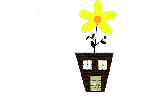
This week at Vox I designed my department page which will be published tomorrow. It was really frustrating actually, because my main image wasn't a normal picture but a clipping mask. I was also trying so hard to fit all of the text, too, which was impossible, but I tried! Also I came up with a little illustration for a piece about a home and garden expo being held at the Hearnes Center in Columbia, Mo which was focusing on how to make your house green when renovating. The idea behind this is the house is the flower pot, and it is so green in grew a flower. Haha, a bit cute/corny, but I think it represents what the expo is about very well. 

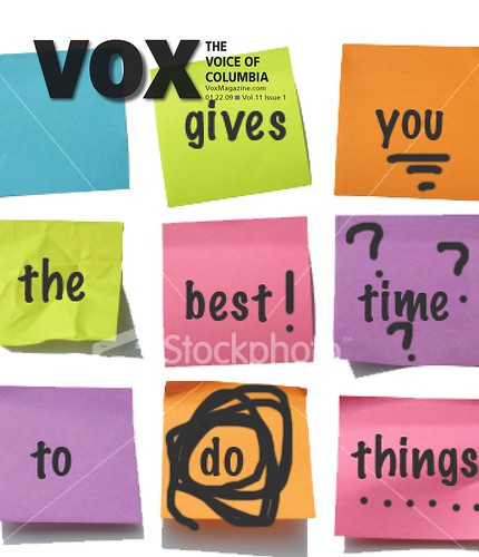
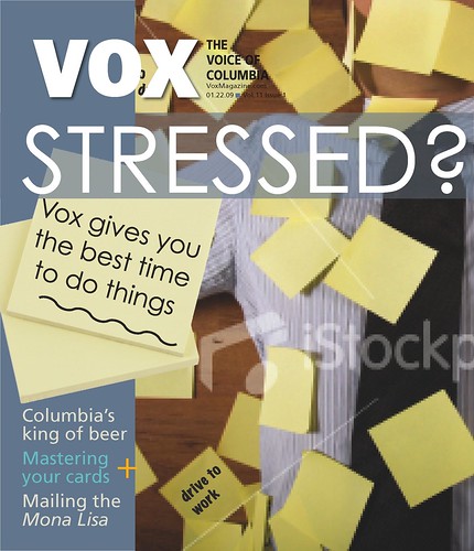
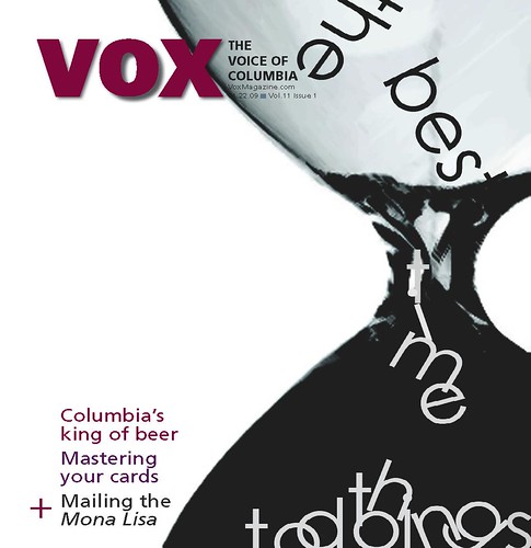
Also this past week I presented my cover ideas for the "Best Time to Do Things Issue," for Vox. I mainly stuck with the sticky note idea and also did something with an hourglass which I really thought was cool, but it didn't go as well with the story as the sticky note design. Anyway, the first design was chosen to be the cover. I am reworking it currently to adjust it and work on making the main cover line dominant. 


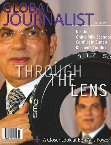
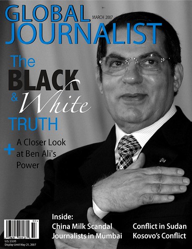
This week I also worked on a cover for the publication Global Journalist. It's a magazine produced by students at Mizzou but written by journalists all over the world. It focuses on democracy and journalism. The publication tends to be more traditional when it comes to design, so the first cover I developed was what a typical Global Journalist cover looks like. Then, I had a little fun. The third cover is actually the one I like the most. The idea behind it is that this man in the photo (Ben Ali-president of Tunisia) has been president for decades. While he has brought the country economic success, freedom of speech is not allowed nor are journalists allowed any freedom to tell the truth and not speak highly of the country and its president. So, the piece was about getting that deeper look at this leader so I thought the illustration conveyed that well...He is blurry, but through the lens, who he is becomes very clear. Let me know if it makes sense to you all, since you have not read the story.


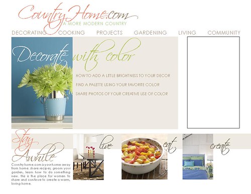
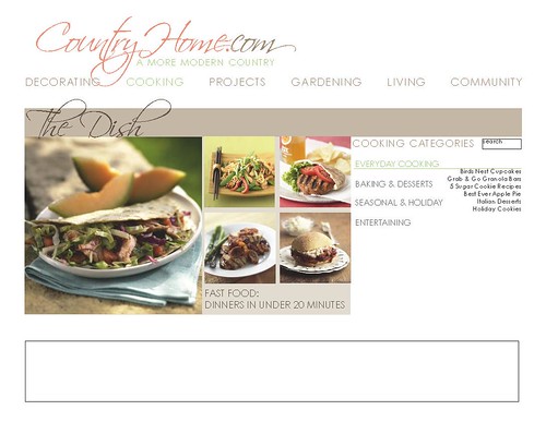
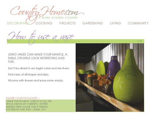
And finally, early this week I presented my ideas for a new website for the magazine CountryHome. I really struggled with this on how to incorporate what was visually appealing and what was technologically feasible as well as how to better organize the site. I was proud of my finished project even though it wasn't chosen. It was a bit of learning experience and I know it will continue to be that way as we make a working website with my colleague Kristin's design. The first page is the home page, the second is a department page, and the third is how a feature would look. 


WHAT'S NEXT:
My spring fashion photo shoot got pushed back until next Wednesday, hooray!, so I will be working on that for the rest of the week and weekend. I will also be making the adjustments to my sticky note cover that was chosen, working on my personal website and portfolio, and getting started on the web project with Meredith. 

Wednesday, February 18, 2009

Week Four

Critique:
This past week I spent some time designing Valentine's day stuff for the boyfriend. It was just a chance to have some fun and play with photoshop. A bit corny, I know. 

I also came up with an illustration for the art department of Vox about an exhibit put on by the True/False Festival (a film festival in Columbia) called "Altered Realities." I did it without having the text or knowing much about the exhibit except the title, so the editors decided it didn't fit well. But I'm going to try to come up with something that does. 

What's Next:
I am also currently working on my web designs for a living magazine in based in Des Moines, Iowa. It's been quite a challenge and after meeting with Jan I have a tad bit more direction. I will be working on that over the weekend, so I will post the final product next week. In addition to developing a mock page for that magazine I will be working on developing my own professional site with all of my best design work.

In addition to working on the art department this week I will be designing three covers for "The Best Time To..." issue.

And finally (me taking a deep breath) I will be spending the weekend shopping & styling outfits for a 6 page spring fashion spread in the April issue of Inside Columbia. I've been gathering inspiration from InStyle and Lucky...I have a few themes I'm playing with..I will be sure to show you the final project!