Wednesday, February 11, 2009

Week Three

While I wasn't slated to hand anything in for Vox this week, I worked on my redesign for the economy feature back during week 1.

CRITIQUE:
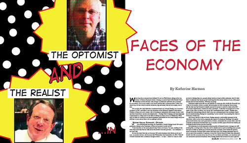
 I still need to work on something for the sidebar, but this gives you my first spread and overall concept. I decided to go with a super-hero theme. I thought it would make a story about the economy more fun and focus on the profiles of the two men. I know that the whole super-hero thing can tend to be overdone, but it did give me practice in photoshop and illustrator (yay!) I was just really trying to go in a completely different direction, so let me know what you think!

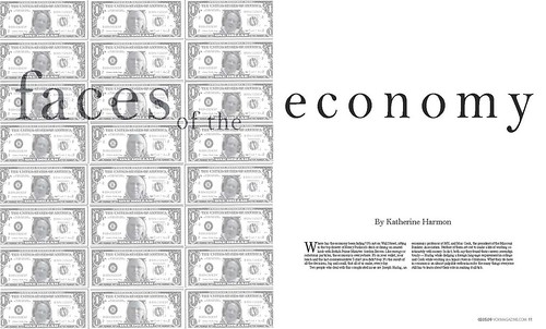
First design:


Here's the new one:

Here's the work I did in photoshop for the photos:



I worked at Inside Columbia a lot over the past week, here are some of the images from the photo shoot. We decided to go with this photo I set up at the shoot instead of the individual images of the items that we took. We usually do separate images, so this was something new for me to play with. After getting the image I clipped it in photoshop--I had some difficulties with getting around the scarf, but I learned a new tool with fading the background to make it easier on me next time. Next I placed the image on the page, picked headline and deck colors, etc. I will have the designed page up soon!


WHAT'S NEXT:
This next week I'll be finishing my economy feature redesign...as well as working on my art department images for Vox. I'm trying to come up with illustrative ideas for the department art instead of the typical event image. There is one piece about an apron exhibit..and another about a home and garden exhibition...think, think, think!

Friday, February 6, 2009

Internship Work>>Inside Columbia


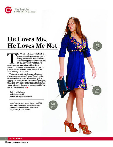
I started interning for Inside Columbia magazine in May 2008 and never left! I started out as a design and editorial intern. I wrote a big piece about skin care, worked on designing the dining guide they produce, and did a few spec-ads. Then I started on a big fashion project towards the end of the 2008 summer--a big fall fashion preview. Now I've basically taken the fashion department over! I do the "Look of the Month," each month I come up with a concept, find an outfit, a model, style the shoot and write the editorial. I also do the "Shopping Page," every month which incorporates the same steps, however I design that page. When I find the time we will start incorporating a shopping page with items for the home. Here is my LOM from February's issue that was just published. Let me know what you think!


Wednesday, February 4, 2009

You Can't Miss>>Crowdspring.com

On the blog I'm following, designers-who-blog.com, and interesting post popped up I wanted to share. While the blogger was complaining about this article published on Forbes.com recently it's an exciting opportunity for freelancers (us!)

The article in Forbes talks about a new website/company called Crowspring.com...they allow businesses who need some type of graphic designing done--a logo, a business card, a t-shirt, a website, etc.--to post the jobs they need and challenge people who know how to design to compete. Read it here >> http://www.forbes.com/forbes/2009/0216/062.html

Designers post what they come up with on this site and can see what everyone else has posted, too. The designer usually only gets a few $100, but what an accomplishment for an aspiring designer. The companies also post their responses to your work on the site, so there is little or no waiting involved. Here is a look at something someone did for a logo for a vegan message board.


And here's a screen shot of their home page--where you can start looking for a project you want to design for and see how much you could potentially be paid!


The business started out of the design need by companies at a cheaper cost. So while it's exciting now we may be sharing the same feelings as the professionals on designers-who-blog.com. Read their reactions >>http://www.designers-who-blog.com/


Response>>The movie Helvetica

Honestly, that movie really through me for a loop. Even as a graphic designer you never really think of the time and thought that goes into font. It's so easy for us to go to a website and find a font to fit our need or style. 

I also had never thought about the way one simple font, Helvetica, could say so many things. A typographer in the movie said something along the lines of helvetica simply says everything. It's a universal font that isn't specific to looking Christmasey or Fallish. It made me think question are use of so many fonts. Are fancy fonts an easy fix for a lazy designer?

I don't think I've taken my position on either side of the fence just yet. Some types just give a piece personality. They say something in themselves. So, I guess the big question is does "I hate you," in helvetica have the same meaning as some angry, bold font? Well in a literal sense of course. But in the magazine world, what is going to get a reader to read that word or sentence? What's going to draw them in and give them a visual representation or aid to what they are reading? 

I'm not quite sure that Helvetica is the be-all end-all of the font world. But, I'm going to explore it much more in my design.

Week Two at Vox>>Spring Cover


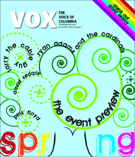
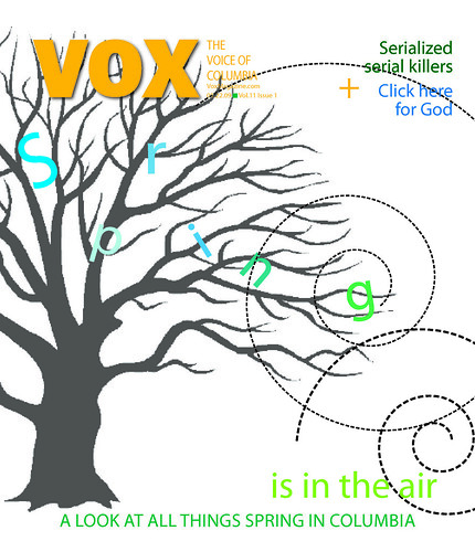
This week at Vox I was re-designing my spring cover from the weekend, which was:


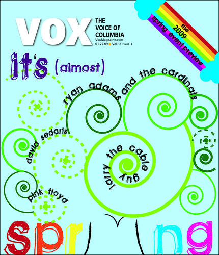
I think I came a long way and am actually really proud of my new covers. One of my biggest critiques was that the original looked fallish. I think I definitely made the new covers springy. The editor also wanted some of the sell lines incorporated into our designs which I also did and liked the way it turned out. It came a long way with only a weekend to design. 

I do think the covers are maybe a little too busy. I could play with color more perhaps, of instead of using swirls for the tree use fully colored in circles to make it more concrete. A small note is I need to change the color of the apostrophe in the second cover, its still black--Oh, the difference of detail. 

I made all of the covers in Illustrator which is becoming a favorite of mine--except I don't know how to do as much as I would like to know. But, every design I do in Illustrator I learn a teeny bit more. 

FUTURE PLANS:
This week is my "Inside Columbia" (the local city magazine) week. I handle the fashion department and so I've been running around town coming up with ideas for the shopping page and look of the month. The shopping page shoot is tomorrow (which I get to "direct") and then I will photoshop the images and design the page. For look of the month I find a model and an outfit and help direct that too and that will be Friday--but I'm awaiting spring shipments at the boutiques. 

I will also be working on my redesign of my Faces of the Economy feature over the weekend and just redesigned the music cover. Here it is:


My idea was from this photo I took during the photo journal:


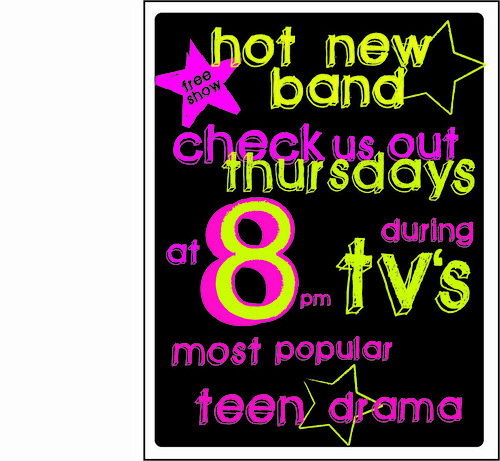
So originally I had more of a flyer looking design but couldn't figure out how to place it on the cover page. So then I decided to have it look like they wrote it on the pavement in chalk..a lot of small bands do that in Columbia around campus. I know I need to find a new font to love (I used that one in both the spring cover and this cover). I also want to find a pavement that is just concrete instead of the rocky texture of my current one. However, I like the overall concept. I'm having a little bit of a creative draught, so If you have any tips I'd appreciate it. Here is a look at the flyer like image I created:


Monday, February 2, 2009

Graffiti Assignment

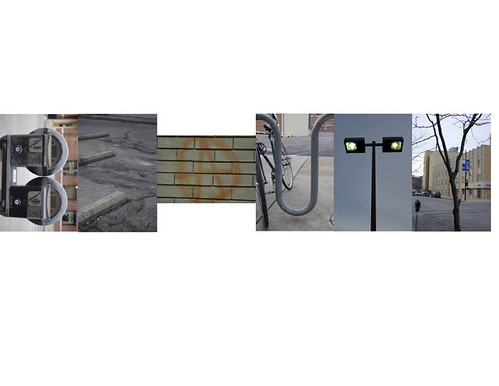
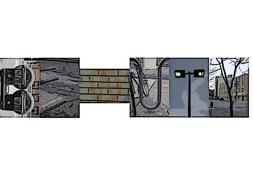
My idea hit me when I was wandering downtown...There are a lot of things that are part of a downtown that are well, ugly. Even the trees don't look pretty--just dull and muted, intermixed with traffic lights and cigarette butts. So I used these elements to create contrast--the word beauty, ugly. 


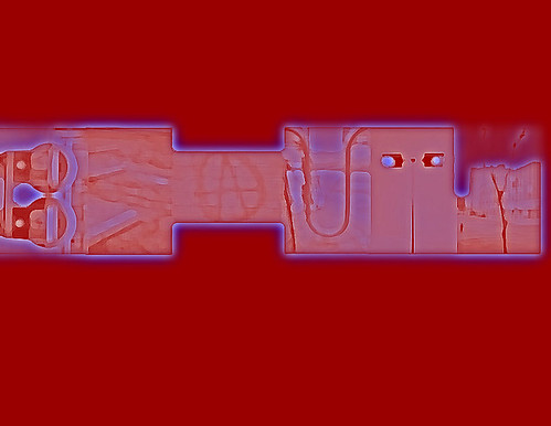
then I had some fun in photoshop:


Photo Journal>>Day 7


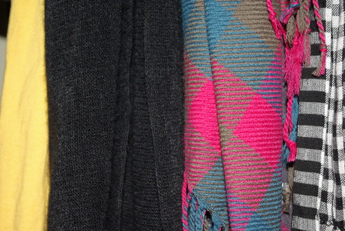
Not the most interesting I know, just a look at reminder to look at pattern, texture and color.